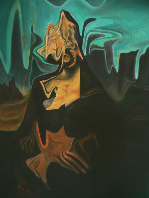
my impression ( retrospectively) of the causeway across to this incredible place, and the importance( if any) of mankind upon this place of beauty
Sunday, 16 January 2011


somewhere in norfolk
 This is a simple impression of two/three(?) figures
on a vast expanse of beach enjoying the simple pleasure and wonder of a sunset
cockle pickers
This is a place beyond beauty in nofolk. For two weeks a year, we live from the sea and rediscover love and life in every sense, love of friends and of nature. This image is available as a very limited edition ( 20 only) signed and numbered giclee print


lots of stuff

A lot has been happening (creatively speaking) since my last blog..around 1866!!! without furtyher ado..the stuff i've been working on
Wednesday, 10 March 2010
the missing link
Turmoil within the mind. I've been busy working on three sets of new ideas.
The first of these involved touching base again with the work and techniques of the old masters, namely Hogarth and Hans Holbein the younger. Different reasons for looking again at these two artists. Hogarth, because of the content and comment of his work and Holbein because of his sublime draughtmanship.
The second of these : observing, drawing and painting fruit, which may seem and probably is, as
mundane a subject that is possible.Why paint fruit? Well there's a subversive twist to these 'still' lifes..trust me!! Harmlessly commercial..perhaps..any depth to these 'pot boilers'...perhaps..i'll
say no more!!
The third of these: Studying the great 'commercial artists' from the 30's onwards.
What is the correlation between these three seemingly different genres?..watch this space
Tuesday, 2 February 2010
Saturday, 21 November 2009
still life and landscape. Pastel on paper.20"x15"
 Stylistically and subject matter wise, a follow on from ' still life'. however, this picture differs slightly in content with the addition of other objects ( included this time are a lump of cheese and fish) and also a hint of landscape.
The composition pivots around the central orange/green object in the centre, diagonally, vertically and horizontally.Equal weights of colour evenly distributed throughout the picture succeed in creating a colour and compositional harmony .
The same artistic influences are obvious in this work, although this time less Nicholsonesque. Some might consider this futile as the high water mark of cubism happened a century ago, with many artists being influenced by, and attempting to, progress the genre further. I want to try
and progress it further still and see what, if any, fresh work or style materialises.
The initial works displayed are merely a touchstone or starting point in this blog and the beginning of this artistic journey, which hark back to analytical cubism 100 years ago. whether the experiment will reach any positive conclusion is a speculative point.
Tuesday, 17 November 2009
still life
 Still life. Pastel on paper. 10"x8"...Does exactly what it says on
the tin!!!! Inspired by the cubist works of messrs Picasso and braque with a hint of the great brit Ben Nicholson thrown into
the mix for good measure. Although some of Nicholson's work
was considered abstract, there is definite symbolic form to it,
i.e. a relative hint at form,even if that hint is merely a colour associated with an element or object. This work here is more
strongly identified with definite form or objects. The two shapes
in the middle of the composition look strongly like bottles..that's because they are!! The object in front of the right hand bottle can either be a vague hint of a wine glass or a piece of fruit..you decide, i know what i want it to be!!..actually it's intended to be a hint of fruit by association of its colour.
This piece has inspired me to 'work up' this drawing into a bigger scale, using the same medium. When this is completed
i will post it.
vaguely familiar faces


are to be part of a joint exhibition that will be entitled: 'Recations, balancing the recent with the now'. My friend and colleague, Ben Clowes and myself have picked two pieces of work from the Saatchi Sensations catalogue to explore, develop and interpret afresh. Ben is developing an idea inspired by a piece origionally executed Martin Maloney. I will keep you updated on its

progress.
These pieces by myself
were inspired by the working method of Marcus Harvey when he
produced his infamous image entitled ' Myra'.
The subject matter may not be to everyones taste, It's not particularly to mine, but as an image it's quite overpowering. The correlation between the subject matter and the technique that achieved it, i.e. pixels in the shape of hand prints, is what appealed to me.
Using this as a point of

departure, i chose a contemporary issue that that galled the vast majority of the
British people, i.e. the expenses scandal at Westminster. Reflecting the popular opinion that most politicians are
pr---s, I chose as my pixel, a custom made rubber stamp of
a phallus and testes about 1 cm in legnth!! ( this was not because of any inside information or speculative rumour)!!,
but because of the fact that the pixel to canvas ratio had to be right. The boards onto which the images were painted or stamped with acrylic paint being 3'x2.'
The project ( so far) has taken about 4 months with the help of an assistant.
Subscribe to:
Posts (Atom)